
Many hoteliers pour time, energy, and significant resources into a modern website and booking system, hoping to boost direct reservations.
Yet despite these efforts, guests often still turn to booking platforms. Why? Contrary to popular belief, it’s not always because of a better deal. More often, it’s the small flaws on your website that quietly drive guests away.
Just one poorly translated sentence, a hidden “Book now” button, or a clunky form can be enough to send potential guests right back to a booking portal.
In this two-part article, you’ll discover 15 serious mistakes that might be holding your website back. The insights are based on dozens of audits I’ve conducted on hotel websites and booking engines.
Important note 😊
Mistake #1 - A Bad First Impression
Imagine this: a potential guest lands on your hotel’s website. Maybe they clicked on an ad, found you on Google, or received a link from a friend. These next few seconds? They decide everything. With just one glance, they might feel, “This place is special - I want to be there!” Or they’ll close the tab and return to a booking portal.
First impressions work on a subconscious level. Guests don’t analyze the details - they simply sense whether your hotel feels modern, well-kept, and trustworthy. But if your website looks outdated, cluttered, or filled with random photos, they might assume that’s exactly what your hotel is like too.
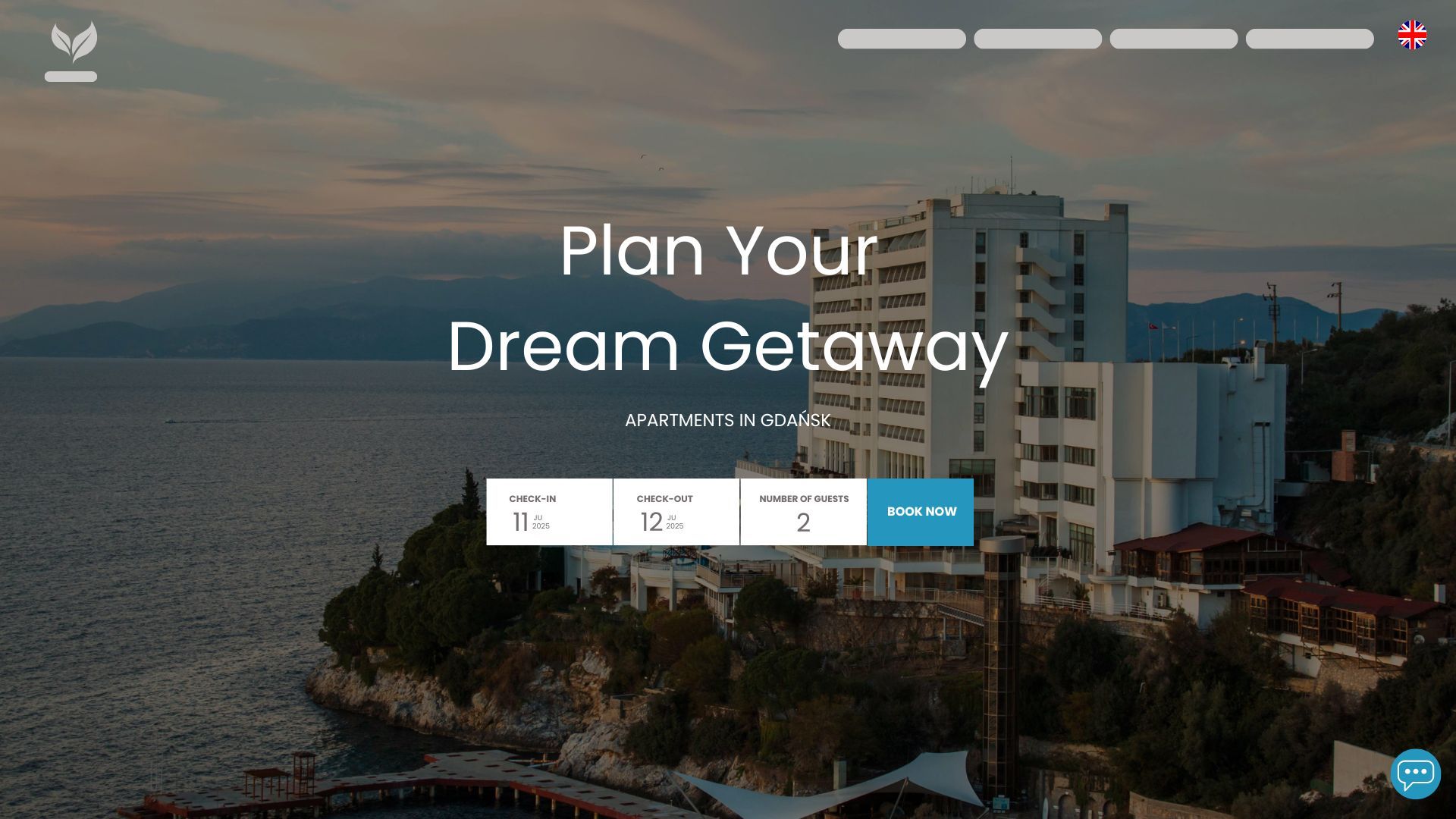
The most important part of any hotel website is the so-called hero section - the first and most prominent part of the page. This is where you capture attention, spark emotion, and guide visitors toward booking.
A modern booking system doesn’t need lengthy descriptions or a long list of attractions right up front. All it takes is a large, atmospheric photo, a compelling headline, a short description, and a clear “Book Now” button. A clean layout, no distractions - everything designed to lead your guest to take action.
How to make a great first impression on your hotel website
Mistake #2 - No visible booking button
It’s a surprisingly common issue: the “Book Now” button is either missing entirely or - worse - it’s there, but doesn’t work. Sometimes it gets lost in a sea of flashy decorations. Other times, it redirects to a page that feels nothing like the hotel’s official website.
That’s when doubt starts to creep in. “Is this site even working?” “Is it safe to book here?” “Maybe I’ll just stick with a portal I trust...”
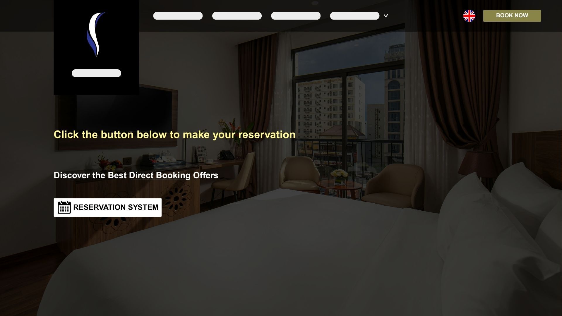
Make sure your “Book Now” button checks all the right boxes:
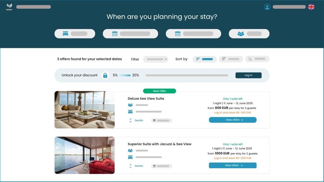
Mistake 3 – Too many steps to book
Hotel websites often feel like a long hallway lined with information. Attractions, blog posts, photo galleries, and booking engine beckon from every side.
Of course, all of this plays a key role in SEO and building a strong brand.
But when a Guest lands on your website, they usually have one goal in mind: book their stay quickly and effortlessly. If there’s even one twist too many along the way, they’ll give up - because on a booking portal, it takes just one click.
The most common mistake? The “Book Now” button appears in only one place - often buried at the bottom of a long page. In many cases, users need to scroll through screen after screen before they even spot the option to make a reservation.
Your booking form should be as simple as it gets. Start with just two questions: travel dates and number of guests. Leave the filters and extra options for the next step.
Don’t make your visitor fill out ten fields right away. It’s a guaranteed way to lose them before they even get started.
How to simplify the booking journey
Mistake #4 - Poor mobile experience
Most guests search for accommodation wherever it’s most convenient - on the go, on the bus, in a café, or while relaxing on the couch in the evening. It’s no surprise, then, that the lion’s share of traffic to hotel websites now comes from mobile devices. What’s more, last-minute bookings and spontaneous getaways are typically driven by mobile users.

Many hotel websites still fail to provide a smooth mobile experience. Tiny buttons, hidden booking forms, a barely visible “Book Now” option - trying to make a reservation like that feels more like a struggle than a convenience.
What makes the difference? Most of all, the sticky CTA buttons we mentioned earlier. With them, guests don’t have to hunt for the booking form - it’s always within reach, right at their fingertips.
To make it effective, your sticky CTA should be clearly visible, high-contrast, large enough to tap comfortably, and easy to read for everyone - regardless of age or dexterity.
And don’t forget speed. Even the best booking system won’t help if your site loads at a snail’s pace. Compress your images, optimize your code, and regularly test your site on various phones. Every second of delay can mean a lost reservation.
How to optimize your hotel website for mobile devices
Mistake #5 - Inconsistency between the hotel website and the booking engine
Nothing breaks the guest's immersion faster than a sudden design shift after clicking “Book Now.” Just moments ago, they were exploring a sleek, polished website - now they’ve landed on a different planet. A different background color, different button styles, different fonts.
Even the smallest inconsistencies raise red flags: “Am I still booking at the same place? Is this secure?”
If your website features soft colors and rounded buttons, your booking engine should mirror that exact style. It’s worth paying attention to the little things - icon shapes, loading animations, micro-interactions. Subtle button highlights, smooth step transitions, and consistent form animations all help reassure the guest they’re still in the right place - and that they can trust you.
It’s the little details that make your Guest feel safe and grounded - like they’ve stayed within the same trusted space from start to finish.
But visual consistency doesn’t stop at design. All your notifications and messages - whether about GDPR, privacy policy, or marketing consents - should follow the same tone and visual style. That applies not only to your main website but also to your booking engine.
If you're sharing information about cancellation policies, payments, or data protection, make sure it's done in the same voice and with the same look - no matter where the Guest is in the journey.
How to ensure a consistent hotel booking experience?
Mistake #6 - No direct links to specific room offers
On a well-designed hotel website, the guest feels in control at every step - especially when browsing the page of a specific room or apartment.
Yet all too often, this experience falls apart at the most crucial moment. Just as the guest is ready to book their chosen room, clicking “Book now” doesn’t take them to that specific offer. Instead, they’re thrown into a general list of all available options.
That’s a mistake that can undo all the hard work invested in your website and booking system. If someone spent 10–15 minutes browsing photos, reading descriptions, and finally picked their perfect apartment, they should be able to start booking that exact offer with a single click.
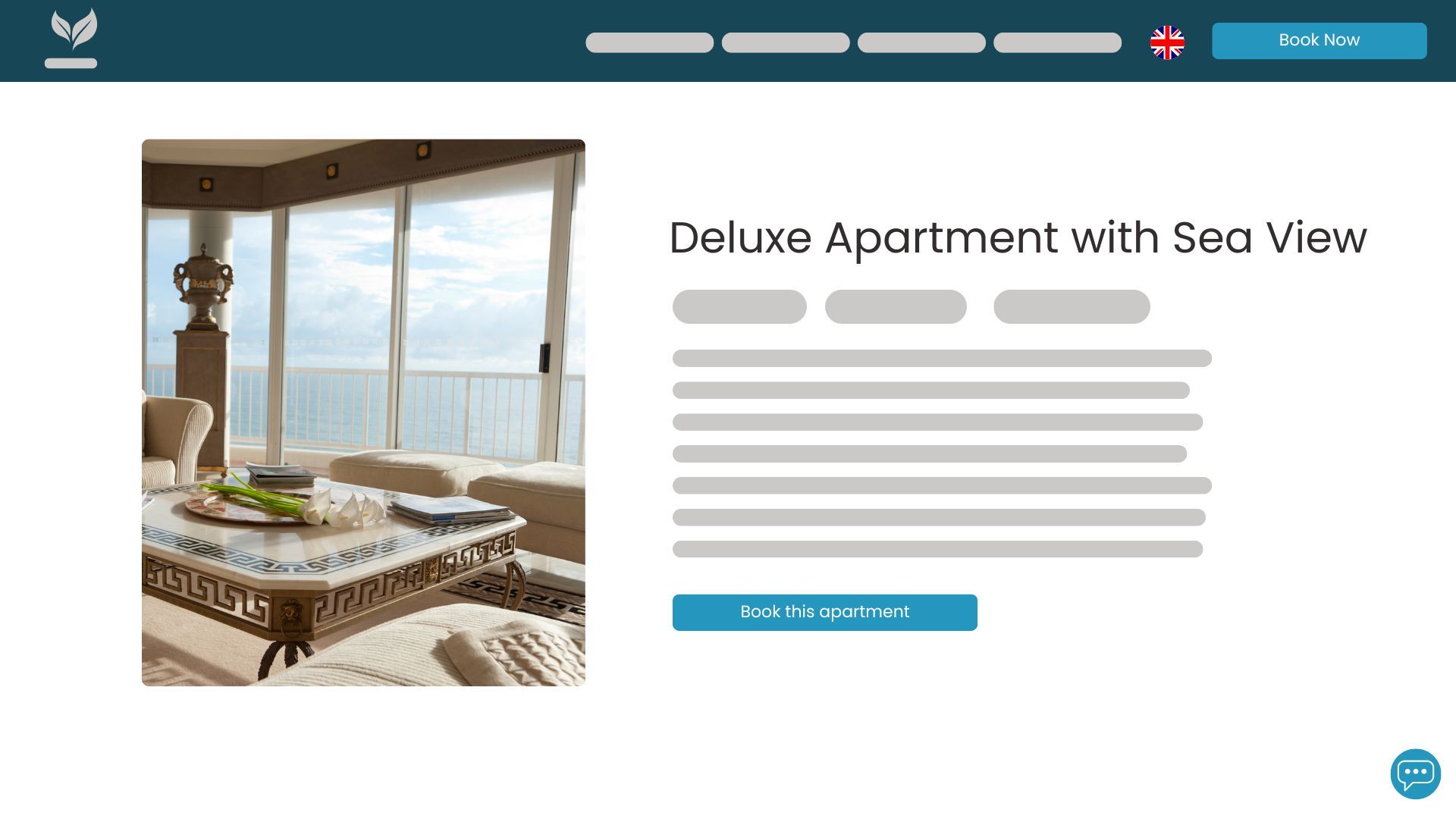
Dedicated “Book this room” buttons play a key role in driving conversions.
But what happens if the selected apartment isn’t available? A well-designed hotel booking system won’t leave your guest staring at a dead-end message like “No availability.” Instead, it immediately suggests alternative dates or similar rooms - keeping the booking journey alive and the guest engaged.
How to set up effective redirects to specific rooms
Mistake #7 - No quick way to contact the reception
A hotel booking system should be more than just intuitive - it should make your Guests feel safe and supported at every step of the reservation process. Few things are more discouraging than a missing or unclear way to contact your staff, especially when a Guest has questions or runs into an issue while booking.
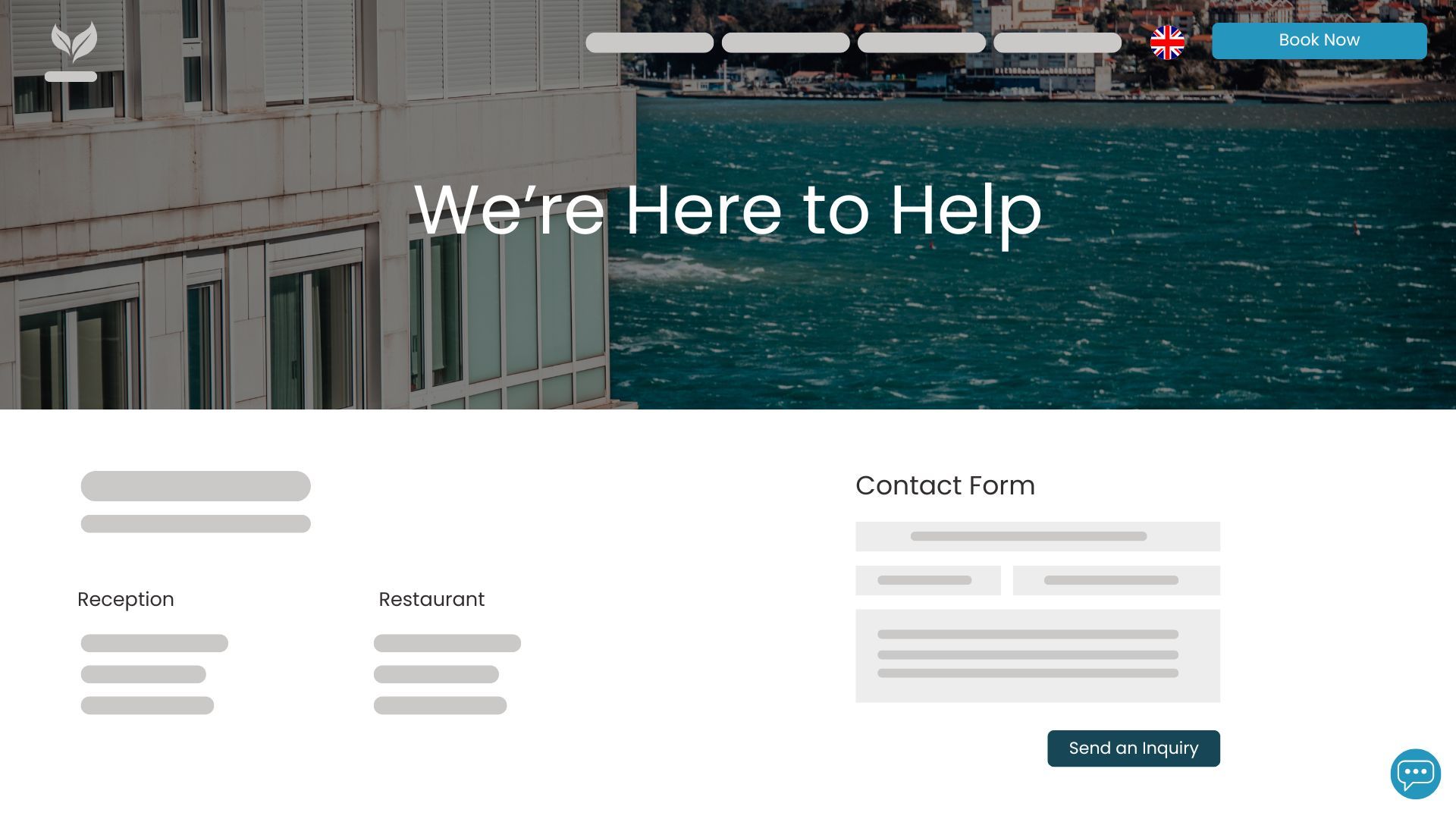
Quick access to the front desk is no longer a luxury - it’s the new standard. Guests increasingly expect that if they have a question or doubt, they’ll be able to get an immediate answer - whether via live chat, a contact form, or simply by picking up the phone.
And yet, many hotel websites still miss the basics: no visible “Call Now” button, no email address in sight. If contact information is hidden in the footer or buried on a separate subpage, potential guests may give up - and leave their reservation unfinished.
Remember: most guests are comparing several properties at once. If your website gives them answers quickly and effortlessly, there’s a good chance they’ll book with you. Fast communication can also be a lifesaver in unusual situations - last-minute availability, special requests, or rescheduling needs.
How to ensure fast and frictionless contact on your hotel website
The booking engine? That’s coming up in part two!
I realize I’ve only just scratched the surface when it comes to the hotel booking engine itself. But let’s be honest - even the best reservation system won’t help much if no one actually clicks through to it, right?
Next week, I promise to dive much deeper into this topic and make up for it properly.
In the meantime, thank you for your time - it’s been a pleasure, and I’ll see you again soon!